Evaluation
In my evaluation I will look at the development process of my music magazine, my target audience and how I aimed to create a successful media product through use of language, institutions, ideology, audience and representation.
In what ways does your media product use, develop or challenge forms and conventions of real media products?
My rock magazine ‘Rocket’ develops and challenges the forms and conventions of other real media products in many different ways. I created my music magazine through researching and analysing other music magazines such as ‘NME’ and ‘Q’ which benefitted my understanding and knowledge of conventional music magazines.
I studied different genres of the magazines such as ‘Blender’ which has an ideology of hip-hop and RnB and ‘NME’ which has an ideology of the rock/indie music genre. Looking at the different genres enabled me to have more of an idea towards creating my rock genre music magazine, mainly inspired by ‘NME’.
My music magazine ‘Rocket’ uses a bold masthead which has rough and rugged edges representing the rock genre, it also creates a house style for the magazine. It would immediately capture the readers attention as it is located in the top left corner which follows the conventions and therefore it would compete well against other music magazines. I have also conventionally used a colour scheme of red, black, white and yellow, a dateline, price, barcode, issue number, an edited main image, cover line, sell line, headline and a ticker tape sell line. I have used these conventions when creating my music magazine as these are all necessary elements required.
On my contents page, I also followed the conventions of a real music magazine such as headlines that section the contents, a band index, a dateline, issue number, a main edited image, a title and an advertisement at the bottom of the page. My double page spread also is conventionally created as it has a large image of the artist, a secondary image, a by-line, an introduction informing the audience what it’s about, a series of questions and answers, a pull quote headline and informal language. I believe that my magazine looks and acts as a professional as other leading music magazines, for example, ‘Kerrang’. I also used props on my front cover and contents page such as, the gun, the lighter and the bible to give the magazine a controversial feel to match the ideology of individuality, alternative and rebellion which the audience could relate to.
How does your media product represent particular social groups?
The social group my music magazine represents is men and women between the age of 16-22 who are interested in listening to and participating in rock and indie music, along with fashion and individuality. The models I used within my magazine depict definite attitudes and an ideology of rebellion and individuality which related to stereotypical youth culture- the target audience. The models style and dress sense are stereotypically designed to fit in with the rock genre which will also attract the target audience as it may reflect their own image. They will also be influenced and inspired by these artists styles as most youths are interested in being ‘cool’ and fashionable. Use of informal and taboo language enabled my magazine to relate to my target audience of teenagers and young people.
What kind of media institution might distribute your media product and why?
My magazine could be distributed by the institution ‘IPC’ as this published ‘NME’ magazine which I based my magazine on. As the music genre I have chosen to base my magazine on is one of the biggest in the music industry, it would be sold in local newsagents as well as large supermarkets where other types of magazines are sold, as it targets such a wide ranged audience. ‘IPC’ has already successfully published ‘NME’ magazine therefore I believe that my magazine would also be successful as it is the same popular genre. I would also sell my media product in music stores which would attract their attention to the magazine as it would feature their favourite artists on the front cover and inform them on the latest news and events of rock/indie artists. I could sell my product on the internet with a subscription offer to promote the magazine sales further as they would be more likely to buy it if it was cheaper.
What would be the audience for your media product?
My target audience for ‘Rocket’ magazine would be 16-25 year olds of mixed gender. This is because this age range are most likely to relate to rock and indie styles, such as the fashion and the way they portray themselves. The artists could also be role models and influence and inspire the target audience. My magazine could also attract more of a
mature older audience who may be interested in rock/indie music due to informal and taboo language used with in the double page spread, also, they can relate to their style/personality through use of the mise-en-scene such as costume used to represent her style and stereotype of being individual and alternative.
How did you attract/address your audience?
I used a lot of different techniques to make sure I attracted my target audience. I asked my friends and siblings, with in the age range of 16-25 , questions like ‘Would you be interested in receiving a free poster pack of your favourite bands/artists with a magazine?’. I used their answers, ideas and opinions to create the perfect balance for my target audience. This includes using an attractive and sophisticated colour scheme and simple and informal language so it was easier to follow, understand and relate to. I used stylish and recognisable typography which stands out. My main image on my front cover has been edited black and white to make the artist look more unique and appealing as well as representing a dark and rebellious side to my artist which creates a connotation. She is also looking directly straight at the camera enabling the audience to become involved with the artist. The name of my magazine is ‘Rocket’ which is a catchy, memorable and funky title. It is also a play on words as it should be ‘rock it’ but as a ‘rocket’ takes off it relates with the success of the artists in the magazine as well as containing the genre in title which will scream at the audience if that interests them, also creating a connotation. The medium long shot of my artist also shows her piercings in her nose and ears which shows the ideology of being a rebellious and unique character who the audience could relate with as well as giving the magazine an individual rock effect. I also used informal language to interview my artist on my double page spread, with use of taboo language which the younger aged audience could relate to.
What have you learnt about technologies from the process of constructing this product?
I feel as though I have learnt a particularly wide range of skills from the process of creating my music magazine. I used ‘Adobe Photoshop’, ‘Microsoft Publisher’ and ‘Paint’ throughout my process. I have learnt how to edit and refine photographs in Photoshop by changing the contrast to get the correct lighting effect to fit my colour scheme. I learnt all of the main elements on Microsoft Publisher which greatly enabled me to create my media product. I also used publisher to do my ICT drafts. I used http://www.dafont.com/ to get an eye catching font that would attract attention and also set a house style for the magazine. Paint helped me edit this font by being able to crop it so no white edges could be seen. It was also easy to use as I only had to copy and paste this from paint to publisher. I also noticed that colour scheme and font style can make or break the magazine. They played a massive role in terms of making my music magazine and I experimented with different types and styles to see which look the best until I came to a final decision. Without learning these technological skills throughout this project I
believe my magazine would not look as professional as it does.
Looking back at your preliminary task, what do you feel you have learnt in the progression from it to the full product?
When both looking at my preliminary task college magazine front cover and my music magazine products I believe there is a clear increase in creativity, knowledge, understanding and skill. I feel I have developed a lot since the preliminary task as I have taken a lot more time and effort to research a clear understanding of magazine conventions, styles and genres. In the music magazine task I have become a lot more confident in using different programmes and challenging different ideas with good use of time management. The preliminary task benefitted me as it was helpful preparation towards progressing in my music magazine. In conclusion, I am very pleased with my final product which I feel looks professional and creative. I also think I have excelled since the preliminary task.
Thursday, 22 April 2010
Thursday, 25 March 2010
Wednesday, 24 March 2010
Friday, 19 March 2010
Sunday, 14 March 2010
double page spread analysis
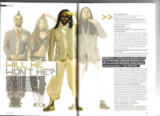
This double page spread includes a main image of hip/hop pop band 'Black eyed Peas', they are all posed and dressed to match the magazines colour scheme of beige, grey, white and black. Fergie is wearing a revealing top showing off her toned body which would immediately attract a male audience to 'Blender' magazine, she also has her hair down showing her feminity whilst wearing boyish clothes. They are all posed with their hands on their faces, heads and in front of them suggesting they are all individuals but unique when they are brought together. The heading 'Will he won't he?' matches the clothes the band are wearing showing how it relates to them. The heading is also a pull quote from the text which is portrayed to be a main message the magazine/artist wants to get across to the audience. The By-line is showing who wrote the article. A page number is featured at the bottom of the page which obeys the contents pages' way of easy following the magazine.
Monday, 8 March 2010
NME analysis of contents page
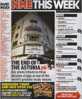
The contents page purpose is to guide the reader and make clear to them what is published and what is actually in the magazine, it helps them find everything. This contents page is very easy to follow, it uses sub headings where everything is catergorised into sections such as 'News', 'Radar', 'Reviews' etc. making it even more simpler for the reader to find. The colour scheme remains the same as the front cover of the magazine. The logo is red and bold making it stand out from the rest of the text. The white background compliments the text colours as it is very clear. The main image of Astoria shows that is a main feature of the magazine as it is displayed on the front cover aswell, it is anchored by the text underneath which is complimented by the white background again, instead of being on the image. It also informs the reader of what the main features are as they were on the front cover by showing black arrows to the right of them. NME contains an easily understandable 'Band Index' letting the reader know what bands are featured in the magazine. The information advertised about subribing the magazine promotes NME further as it is will attract more people if the magazine could be bought for cheaper prices. Inside the red arrow at the bottom right hand side of the page informs the reader that they will 'The UK'S No1 gig guide' on p60, as it the UK's number 1 this will attract more of an audience who may be interested in attending gigs with their favourite bands/artists there.
What does a typical music magazine double page spread consist of?
-Band Name
-Large Image
-Caption
-Text
-Main Quote
-Page Number
-Institution
-Section of the Magazine
-Large Image
-Caption
-Text
-Main Quote
-Page Number
-Institution
-Section of the Magazine
Analysis of Q double page spread
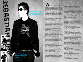
This double page spread includes a main image of 'music artist' 'Sebastian King', he is posed with his hands in his pockets, his jacket open looking to the right, this portrays him to look 'cool' and tough with help from the sunglasses, which is clearly a fashion statement as theres no sun. It consists of two pull quotes from the text in a turquoise colour making it stand out against the grey background, also telling the audience that this is the main theme of the text. His clothing and the way his pictures are edited follow the colour scheme of grey, black, white and turqouise. The target audience is aimed predominantly at a female audience as he is a 'cool' male solo artist, however, it is also aimed at males as they could be interested in the type of music this artist produces. The first letter of the text is in a large capital which immediately attracts the audience to start reading the text as it clearly shows where it begins.
Q magazine contents page analysis
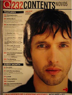
The contents page purpose is to guide the reader and make clear to them what is published and what is actually in the magazine, it helps them find everything. This contents page is very easy to follow, it uses sub headings where everything is catergorised into sections such as 'Features' telling the reader what is featured in the magazine and 'Every Month' telling the reader where to find the pages which are always in the magazine. The colour scheme is red, black and white. The logo is red and bold making it stand out from the rest of the text. The white background compliments the text colours as it is very clear. The main image of 'James Blunt', a very popular inde artist shows that is a main feature of the magazine and represents its ideology of inde/rock music. It has the date and issue number in very bold lettering informing the reader of how recent the issue is. Q contents page doesn't contain as much information as NME contents page showing its simpler and clearer way of following the magazine.
Q Magazine Front Cover Analysis
 The target audience of Q magazine is clearly aimed at teenagers/students, its targeted at a both male and female audience with an interest in the ideology of rock/indie music. This music magazine could also appeal to an older aswell as a generally younger audience as it contains successful older bands such as the stone roses along with newer artists such as Lilly Allen featured on the main image. The main image of her screams male attention as she is topless and posed in a slightly provocative manner. The panthers also in the image show toughness and power of lilly allen aswell as matching the cover line 'Lily Alllen & her wicked wicked ways...' as Lily is a tough/wicked character and role model for girls/women. The colour scheme consists of red, blue, black and white so that all writing stands out against the pale grey background. The barcode is placed on the right hand corner of the page where it always is alond with the price. The logo is bright in red at the top of the page so that it stands out when in shops and newspaper stands in shops. Plugs on the page include the content involved in the magazine so the audience know what they are going to be reading about. It also has a list of bands and information at the bottom of the page which reinforces the target audience- people interested in the rock/indie music genrre. The institution of this magazine is Q which is also a music channel, owns a website and also does Q TV. Q's current editor is Paul Rees, former editor of the UK edition of Kerrang! another musical Bauer publication based on heavier rock/metal music.
Music magazine double page spread analysis
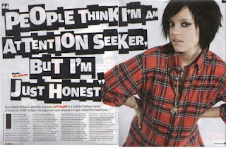 This double page spread includes a main image of indie music artist 'Lily Allen', she is posed with her hands placed on her hips making her look in control and tough. This also links in with the heading, 'People think im an attention seeker, but i'm just honest', as it shows that she is making a strong statement. Her clothes also match the colour scheme of the double page spread and her tattoo is showing symbolising that she is a rebellious character.
The heading is also a pull quote from the text which is portrayed to be a main message the magazine/artist wants to get across to the audience. 'Lily Allen' is written in the top right hand corner of the page in a black box instantly informing the reader who the article is about, her name is also written in red font amongst black font making her immediately stand out to the audience. A page number is featured at the bottom of the page along with the name of the magazine and the date which reinforces the advertisement of the company whilst displaying clear information to help search the magazine.
NME contents page analysis
 The title of the music magazine 'NME' is in bold red letters which reminds the audience of the institution. It also is in bright red font to catch the eyes of the audience to make them more familiar with the company.
Although the font size differs, the font remains the same throughout the contents page in order for the audience to recognise this as a symbol of the magazine. The colours red and black are also iconic on the contents page as a representation of the magazine. The clear structure is easy to follow for the reader as it contains subheadings such as 'News', 'Radar' and 'Live' therefore it is easy to find certain pages.
Main images of popular rock band 'Oasis' make the audience want to read on and find out more about their favourite artists. Also due to having such a successful rock band on the contents page, it will heighten the status of this magazine.
The targeted audience is shown clearly from aspects featured on this contents page as it uses ultra famous rock band, Oasis, and also, the presentation and font on the page gives off an individual effect immediately aiming the magazine at people who enjoy rock and indie music.
The band index also sets the approached audience as it contains more rock/indie bands and it also promotes the magazine further as it may have a feature on somebodys favourite band.
The advert stating 'Subscribe today save 33%' is also a way of promoting the magazine as it is offering discount.
Subscribe to:
Comments (Atom)


