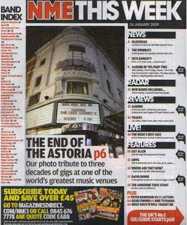
The contents page purpose is to guide the reader and make clear to them what is published and what is actually in the magazine, it helps them find everything. This contents page is very easy to follow, it uses sub headings where everything is catergorised into sections such as 'News', 'Radar', 'Reviews' etc. making it even more simpler for the reader to find. The colour scheme remains the same as the front cover of the magazine. The logo is red and bold making it stand out from the rest of the text. The white background compliments the text colours as it is very clear. The main image of Astoria shows that is a main feature of the magazine as it is displayed on the front cover aswell, it is anchored by the text underneath which is complimented by the white background again, instead of being on the image. It also informs the reader of what the main features are as they were on the front cover by showing black arrows to the right of them. NME contains an easily understandable 'Band Index' letting the reader know what bands are featured in the magazine. The information advertised about subribing the magazine promotes NME further as it is will attract more people if the magazine could be bought for cheaper prices. Inside the red arrow at the bottom right hand side of the page informs the reader that they will 'The UK'S No1 gig guide' on p60, as it the UK's number 1 this will attract more of an audience who may be interested in attending gigs with their favourite bands/artists there.
No comments:
Post a Comment