
Thursday, 25 March 2010
Wednesday, 24 March 2010
Friday, 19 March 2010
Sunday, 14 March 2010
double page spread analysis
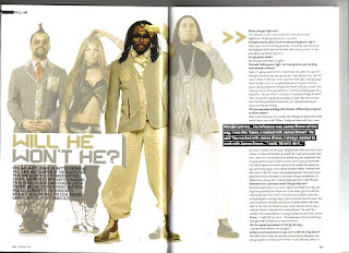
This double page spread includes a main image of hip/hop pop band 'Black eyed Peas', they are all posed and dressed to match the magazines colour scheme of beige, grey, white and black. Fergie is wearing a revealing top showing off her toned body which would immediately attract a male audience to 'Blender' magazine, she also has her hair down showing her feminity whilst wearing boyish clothes. They are all posed with their hands on their faces, heads and in front of them suggesting they are all individuals but unique when they are brought together. The heading 'Will he won't he?' matches the clothes the band are wearing showing how it relates to them. The heading is also a pull quote from the text which is portrayed to be a main message the magazine/artist wants to get across to the audience. The By-line is showing who wrote the article. A page number is featured at the bottom of the page which obeys the contents pages' way of easy following the magazine.
Monday, 8 March 2010
NME analysis of contents page
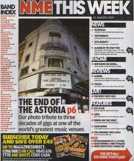
The contents page purpose is to guide the reader and make clear to them what is published and what is actually in the magazine, it helps them find everything. This contents page is very easy to follow, it uses sub headings where everything is catergorised into sections such as 'News', 'Radar', 'Reviews' etc. making it even more simpler for the reader to find. The colour scheme remains the same as the front cover of the magazine. The logo is red and bold making it stand out from the rest of the text. The white background compliments the text colours as it is very clear. The main image of Astoria shows that is a main feature of the magazine as it is displayed on the front cover aswell, it is anchored by the text underneath which is complimented by the white background again, instead of being on the image. It also informs the reader of what the main features are as they were on the front cover by showing black arrows to the right of them. NME contains an easily understandable 'Band Index' letting the reader know what bands are featured in the magazine. The information advertised about subribing the magazine promotes NME further as it is will attract more people if the magazine could be bought for cheaper prices. Inside the red arrow at the bottom right hand side of the page informs the reader that they will 'The UK'S No1 gig guide' on p60, as it the UK's number 1 this will attract more of an audience who may be interested in attending gigs with their favourite bands/artists there.
What does a typical music magazine double page spread consist of?
-Band Name
-Large Image
-Caption
-Text
-Main Quote
-Page Number
-Institution
-Section of the Magazine
-Large Image
-Caption
-Text
-Main Quote
-Page Number
-Institution
-Section of the Magazine
Analysis of Q double page spread
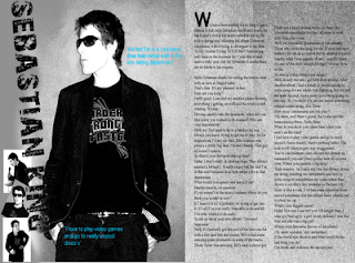
This double page spread includes a main image of 'music artist' 'Sebastian King', he is posed with his hands in his pockets, his jacket open looking to the right, this portrays him to look 'cool' and tough with help from the sunglasses, which is clearly a fashion statement as theres no sun. It consists of two pull quotes from the text in a turquoise colour making it stand out against the grey background, also telling the audience that this is the main theme of the text. His clothing and the way his pictures are edited follow the colour scheme of grey, black, white and turqouise. The target audience is aimed predominantly at a female audience as he is a 'cool' male solo artist, however, it is also aimed at males as they could be interested in the type of music this artist produces. The first letter of the text is in a large capital which immediately attracts the audience to start reading the text as it clearly shows where it begins.
Q magazine contents page analysis
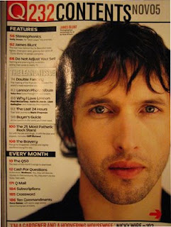
The contents page purpose is to guide the reader and make clear to them what is published and what is actually in the magazine, it helps them find everything. This contents page is very easy to follow, it uses sub headings where everything is catergorised into sections such as 'Features' telling the reader what is featured in the magazine and 'Every Month' telling the reader where to find the pages which are always in the magazine. The colour scheme is red, black and white. The logo is red and bold making it stand out from the rest of the text. The white background compliments the text colours as it is very clear. The main image of 'James Blunt', a very popular inde artist shows that is a main feature of the magazine and represents its ideology of inde/rock music. It has the date and issue number in very bold lettering informing the reader of how recent the issue is. Q contents page doesn't contain as much information as NME contents page showing its simpler and clearer way of following the magazine.
Q Magazine Front Cover Analysis
 The target audience of Q magazine is clearly aimed at teenagers/students, its targeted at a both male and female audience with an interest in the ideology of rock/indie music. This music magazine could also appeal to an older aswell as a generally younger audience as it contains successful older bands such as the stone roses along with newer artists such as Lilly Allen featured on the main image. The main image of her screams male attention as she is topless and posed in a slightly provocative manner. The panthers also in the image show toughness and power of lilly allen aswell as matching the cover line 'Lily Alllen & her wicked wicked ways...' as Lily is a tough/wicked character and role model for girls/women. The colour scheme consists of red, blue, black and white so that all writing stands out against the pale grey background. The barcode is placed on the right hand corner of the page where it always is alond with the price. The logo is bright in red at the top of the page so that it stands out when in shops and newspaper stands in shops. Plugs on the page include the content involved in the magazine so the audience know what they are going to be reading about. It also has a list of bands and information at the bottom of the page which reinforces the target audience- people interested in the rock/indie music genrre. The institution of this magazine is Q which is also a music channel, owns a website and also does Q TV. Q's current editor is Paul Rees, former editor of the UK edition of Kerrang! another musical Bauer publication based on heavier rock/metal music.
Music magazine double page spread analysis
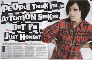 This double page spread includes a main image of indie music artist 'Lily Allen', she is posed with her hands placed on her hips making her look in control and tough. This also links in with the heading, 'People think im an attention seeker, but i'm just honest', as it shows that she is making a strong statement. Her clothes also match the colour scheme of the double page spread and her tattoo is showing symbolising that she is a rebellious character.
The heading is also a pull quote from the text which is portrayed to be a main message the magazine/artist wants to get across to the audience. 'Lily Allen' is written in the top right hand corner of the page in a black box instantly informing the reader who the article is about, her name is also written in red font amongst black font making her immediately stand out to the audience. A page number is featured at the bottom of the page along with the name of the magazine and the date which reinforces the advertisement of the company whilst displaying clear information to help search the magazine.
NME contents page analysis
 The title of the music magazine 'NME' is in bold red letters which reminds the audience of the institution. It also is in bright red font to catch the eyes of the audience to make them more familiar with the company.
Although the font size differs, the font remains the same throughout the contents page in order for the audience to recognise this as a symbol of the magazine. The colours red and black are also iconic on the contents page as a representation of the magazine. The clear structure is easy to follow for the reader as it contains subheadings such as 'News', 'Radar' and 'Live' therefore it is easy to find certain pages.
Main images of popular rock band 'Oasis' make the audience want to read on and find out more about their favourite artists. Also due to having such a successful rock band on the contents page, it will heighten the status of this magazine.
The targeted audience is shown clearly from aspects featured on this contents page as it uses ultra famous rock band, Oasis, and also, the presentation and font on the page gives off an individual effect immediately aiming the magazine at people who enjoy rock and indie music.
The band index also sets the approached audience as it contains more rock/indie bands and it also promotes the magazine further as it may have a feature on somebodys favourite band.
The advert stating 'Subscribe today save 33%' is also a way of promoting the magazine as it is offering discount.
Subscribe to:
Comments (Atom)


